

About three years ago, I followed in the hallowed footsteps of Cam Lawrence and Josh Weissbock and created a prospect cohort model in the image of PCS, the legendary statistical model that (among other talents) earned them jobs with the Florida Panthers.
I named my model pGPS, short for Prospect Graduation Probabilities System, an apt description of the model’s intention. Numbers and charts generated based on the model have since been used in hundreds of CanucksArmy articles, and provided to other spaces including The Athletic, the Vancouver Province and most recently Elite Prospects (CanucksArmy alumni being a common thread).
While I am grateful for the acceptance and spread of the metric, one thing has irked me for quite a while: it has been years since I last did a definitive, descriptive article of the state of the model, and so when credited, the article that typically gets referenced is the woefully outdated introductory article from 2016.
That changes today, as I have composed an article describing the present state of pGPS. My intention is for this article to function as a reference point going forward when the model is used elsewhere. As such, it will remain unlocked so anyone can gain a functional understanding of pGPS when they come across it.
The Current State of pGPS
When pGPS was introduced, it was a fairly straightforward system. I used a similarity formula to compare the statistics of a present player against statistics of players from years past. Players above a specified similarity threshold were considered “matches.” I then determined the percentage of those matches that ended up becoming full time NHL players, using a simple threshold of 200 NHL games played.
Since then, major developments include the expansion and adjustment of input statistics for comparison (originally three factors – age, height and adjusted points per game – were considered; that number is now up to nine, including era- and age-adjusted points, goals created and point shares per game, and more) and the weighting of output statistics based on similarity (more on that below).
Late last year, I wrote about the development of cohort models, and moving away from games played thresholds to determine success and toward production thresholds; that is, the percentage of the cohort that qualified as top-12 forwards or top-6 forwards, and top-6 defencemen or top-4 defencemen. pGPS is now using the following terminology for output values:
- XLS%: Expected Likelihood of Success. This is the base value that is designed to indicate the likelihood of a player becoming a regular NHL player. That is, one of the top-12 forwards or top-6 defencemen on an NHL team.
- iXLS%: Impact Expected Likelihood of Success. This value is designed to determine the likelihood of a player becoming an impact NHLer: a top-6 forward or top-4 defender. An important note is that these values correlate highly with one another. That which makes a player more likely to be an NHL player at all also makes them more likely to be an impact player at that level. This point cannot be understated.
- XPR: Expected Production Rate. This is the expected rate of points per 82 games based on the players that make up the historical cohort (weighted by similarity).
- XPS: Expected Point Shares. This is the expected rate of point shares per 82 games, again based on the players in the historical cohort (and again weighted by similarity).
There are many other numbers that I can derive from a player’s historical cohort, including weighted career average ice time, shot rate, and average games played before age 25, but the predictivity of these values tends to be less than those named above, so their usefulness is more in context than description.
pGPS results lend themselves to visualization in a number of different ways, but the most popular is the bubble chart shown below.
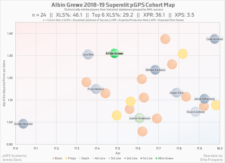
Bubble charts should be interpreted with care, as the distance between bubbles does not necessarily align with the similarity of said players. This is because the chart is plotting in two dimensions (age and point production), while the similarity formula incorporates nine different factors, essentially measuring distance in nine-dimensional euclidean space. Once I come up with a simple way to plot data in nine dimensions, I’ll let you know.
The major advantage of the bubble chart is that it is a convenient method of demonstrating the player’s cohort. The colour-coded bubbles convey a sense of how successful the cohort was (more blue is better than more red, and the darker the blue, the better), and even lists the names of the successful players in a more aesthetically pleasing style than the table pictured above.
Other commonly used charts include the production tiered pie charts, career charts, and production spectrum charts. I intend to publish another article between now and the draft that breaks down these various forms of pGPS visualization.
Benefits of a Cohort Model
Cohort models like pGPS are a quick and easy way to compare players of different ages and different leagues. While score adjustment models like SEAL provide a more direct comparison of player production, cohort models level the playing field in their own way. The results have contextual adjustments built in, and include the added benefit of being more intuitive in their presentation.
For example, one can know that a SEAL rate of 1.40 is better than 1.10, but not have any idea of what either means in terms of their future in the NHL. Conversely, one can tell that a 50% likelihood of success is better than a 20% likelihood of success, and also automatically get a clear impression of what that number means for that player in terms of their career projection.
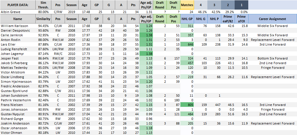
Another major benefit of cohort models is that the methodology (taking a lot of similar players and seeing how they performed as pros) makes it difficult to dispute the results. For example, the table below lists the statistical matches for 2019 draft-eligible prospect Albin Grewe. One scout might look at the player and his production and develop a strong opinion on what that indicates for the player’s future. pGPS, however, finds a host of similar players and demonstrates objectively how many different ways a career can unfold. Often times a positive opinion clouds judgment and obscures the memory of times that similarly productive junior players flopped in the NHL – pGPS lays it all out for all to see.
pGPS also inherently incorporates the value of playing in a high end league, unlike adjusted scoring metrics. For instance, a draft-eligible player with zero points in the SHL will still have a decent expected likelihood of success because plenty of players historically have had NHL careers after having no production in a European pro league. This is largely due to the fact that just being in that league at that age is an accomplishment on its own. Conversely, zero points in the SHL looks the same as zero points in the BCHL, because there is no scoring to adjust.
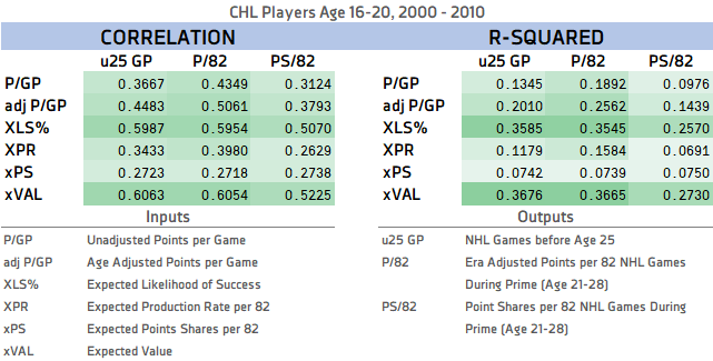
Last, but certainly not least, pGPS has a significant predictive advantage over raw point rates or even adjusted point rates, when it comes to predicting NHL games played and NHL production. The chart below and more information regarding the predictivity of pGPS can be found in this article.
Limitations of a Cohort Model
pGPS is a pure cohort model; by that I mean that it derives results directly from player cohorts. Though the players deemed as matches are weighted by similarity to help increase the accuracy of the percentages, the system requires matches to produce results. Players that are producing at unprecedented rates for their league and position are frequently labeled as indescribable by pGPS.
This is something that happens at the very top of the draft each year, especially if the top of the draft is populated by players from outside the CHL. This season, each of Jack Hughes, Kaapo Kakko and Alex Turcotte are creating this issue for pGPS. It’s also an issue for players playing in leagues that don’t have an issue of producing elite 18-year old talent, such as when Auston Matthews played in the Swiss National League A in 2016 or when Cale Makar dominated the Alberta Junior Hockey League in 2017.
As a result of these limitations, I believe that a cohort model struggles to properly order prospects in the top five or ten spots of a draft, but its value increases tremendously as the draft proceeds.
Cohort models are also limited by virtue of the fact that they are bound by historical biases. While switching from a games played threshold to a production threshold has lessened some of this bias, the players that make up the cohort were in part helped by factors beyond their mere skill. Many were given opportunities because of biases at the scout, coach, or general manager level, whether that be size, nationality, or playing style. Cohort models like pGPS continue to undervalue players under six feet, for example, because they historical had less opportunity than they do now. Considerations are being made for how to account for those sorts of biases.
On Assigning Line/Pair Scores to Historical Players
As mentioned, pGPS has moved toward production thresholds as opposed to games played thresholds. That whole system now relies on each player in the database (that has played in the NHL) being given a line or pair score (i.e., a first line player, or a second pair defender).
To accomplish this, I looked at a number of statistics for each player in my NHL database. First and foremost, it was important to narrow the stats down to only the primes of the players’ career; players naturally ramp up at younger ages and tail off at older ages. It would unfairly disadvantage a player that played well into their 30’s with diminishing production if the totality of the career was considered. Instead, only age-21 to age-28 seasons were included.
Each individual player-season was given a line/pair score for points, ice time and point shares based on positional rankings (e.g. top 90 forwards in a 30-team league are considered first-line forwards, and so on). Player-seasons outside the top 4 lines/top 3 defensive pairs, but still with regular playing time were labeled depth-player-seasons. I then averaged those scores over the prime years and combined them into a single line/pair score. Those scores are then considered when analyzing a specific player’s cohort.
For the sake of visualization (seen above and below), the players are colour-coded based on their line/pair scores, with dark blue representing first-line forwards/first-pair defenders, and getting lighter as you descend in score.
On Weighting Matches by Similarity
Even though all of a player’s cohort matches have cleared the assigned similarity threshold, that doesn’t mean they are all equal in terms of their similarity to the subject player. For that reason, I incorporated similarity-based weighting.
Weighting the matches of the cohort can sometimes have a significant effect on the results. The chart below is again from Albin Grewe’s cohort. The top bar shows standard proportional weight – being that n = 24, each match accounts for 1/24th (or 4.2%) of the whole. The bottom bar shows the matches weighted by similarity.
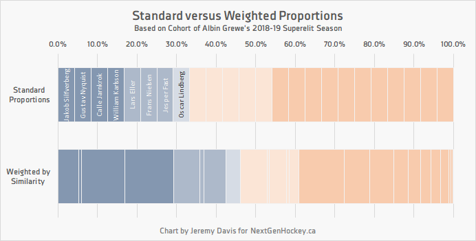
As a result of being highly similar to some of the successful matches (e.g. Calle Jarnkork and William Karlsson, who represent the third and fourth dark blue segments), and comparatively less similar to many of the failed prospects, the expected likelihood of success increases by more than 10% when considering weighted versus standard proportions. That gives Albin Grewe an XLS% of ~46% instead of ~33%.
Scope of Use of Cohort Models
I’ve said this many times before, but I’ll say it again: I like to consider cohort success percentages to be like betting odds. They are a starting point, a basic likelihood of an occurrence, and it is the analyst’s job to determine whether or not the odds can be beaten. There are a number of contextual factors that can exert influence here, including factors that can be quantified (quality of linemates, power-play opportunity, puck luck), and factors that cannot be quantified (such as playing through injuries or resolvable off-ice issues) but can still be considered.
It’s important to remember that statistics are not designed to replace traditional scouting. Anyone who suggests such a thing either hasn’t thought the argument through or is trying to sell you something. Microstat tracking is another step in the direction of statistical independence, but there are so many other factors that need to be considered when analyzing prospects. The input data of cohort models are several degrees of complexity behind microstat analysis. Thus, cohort models should be used in conjunction with other statistics, traditional scouting, and good old-fashioned research.
Dad, husband, hockey fan. Founder/analyst/editor/admin of NextGenHockey.ca. Contributor at CanucksArmy and the Nation Network. Blending video analysis and statistical modeling. pGPS, SEAL, etc. The Minnesota Twins are finally good again!